Activity: Blending Modes
We first learned about shaded relief maps when working with raster layers. You may have noticed that by by altering the opacity of one layer, the end product looks faded out like in the example below, where the SR_50M_alaska_nad layer is set at 60% opacity.

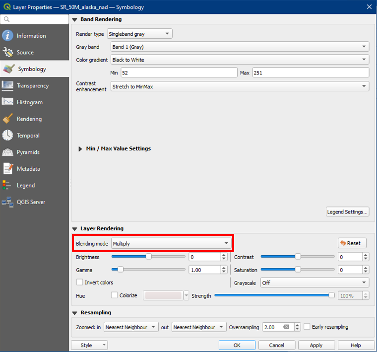
However, we can improve the contrast of the map by working with blending modes. Open the layer properties of your top layer, in this case, the SR_50M_alaska_nad. Under the Symbology side tab, go to the Layer Rendering section and choose Blending mode: Multiply.
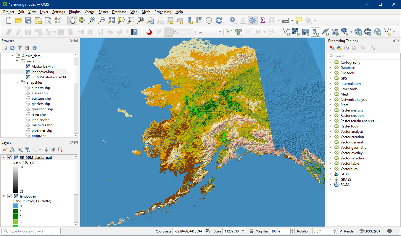
Your map should look much more vibrant than before, yet you can also see the shaded relief details clearly, like in the mountainous areas. Feel free to test out the other blending mode options and see how they differ. You can also further adjust the transparency of this top layer to determine how visible you would like the shaded relief to appear. To learn more about blending modes, here is a good article.
Activity: Selective Labelling
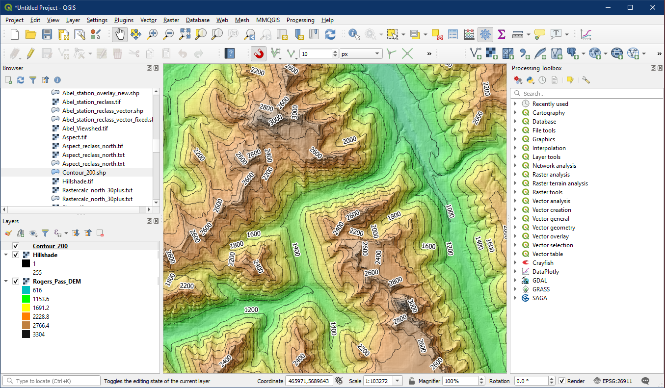
Sometimes the default labels can be too cluttered, or maybe we only want to label a subset of a layer. For example in the Rogers Pass data, labelling every single contour line can be too much. Here is the default contour labelling with white buffers.
First of all, let’s update the labelling placement so that they curve to fit the contour lines. Under contour layer properties > Labels > Placement (A) > Select Curved placement (B).
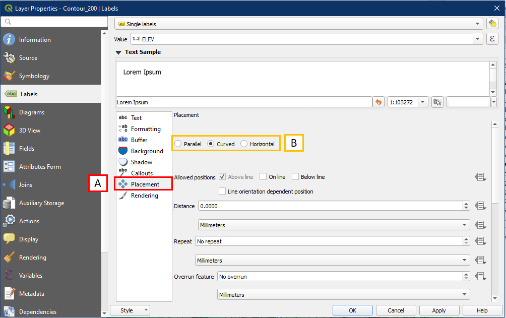
Now the labels are less jagged and curves when possible.

Now to back into the labelling properties. This time go into Rendering (A) > Show label (B) > Edit… (C)

For this example imagine we only want to show labelling for every second contour, so enter the following into the Expression box (A):
"ELEV" IN (400, 800, 1200, 1600, 2000, 2400, 3000)
This is a form of SQL query, which we touched on in Tutorial 7 (Attribute data basics). The query above is telling QGIS to look at the ELEV field in the attribute table, and select only values that are listed in the brackets. To reduce the potential for typos, it may be useful to click on the field name and operators in the list of query commands provided (B). Click OK once done.

Now only elevation values that we selected will appear.

Activity: Map Border Frames
This activity will focusing on creating a grid frame. Here is an almost finished map and we would like to add coordinate information along the map frame. To do so select the map panel > Item Properties (A) > under Grids select Add a grid (B) > Modify Grid (C).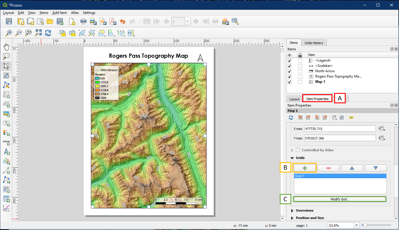
The Map Grid Properties will appear. Enter a desired grid interval (A) and give it a frame style under Frame (B).

Check the box beside Draw Coordinates (A) and coordinates will appear around the map frame. The default is usually pretty good, but it can be adjusted, such as making the left and right coordinate vertical instead of horizontal (B). Now we see the coordinates which can make referencing locations easier, such as the artillery gun station locations for example. Since the CRS of this project (26911) uses metres as the default unit, these values will represent easting and northing in metres.

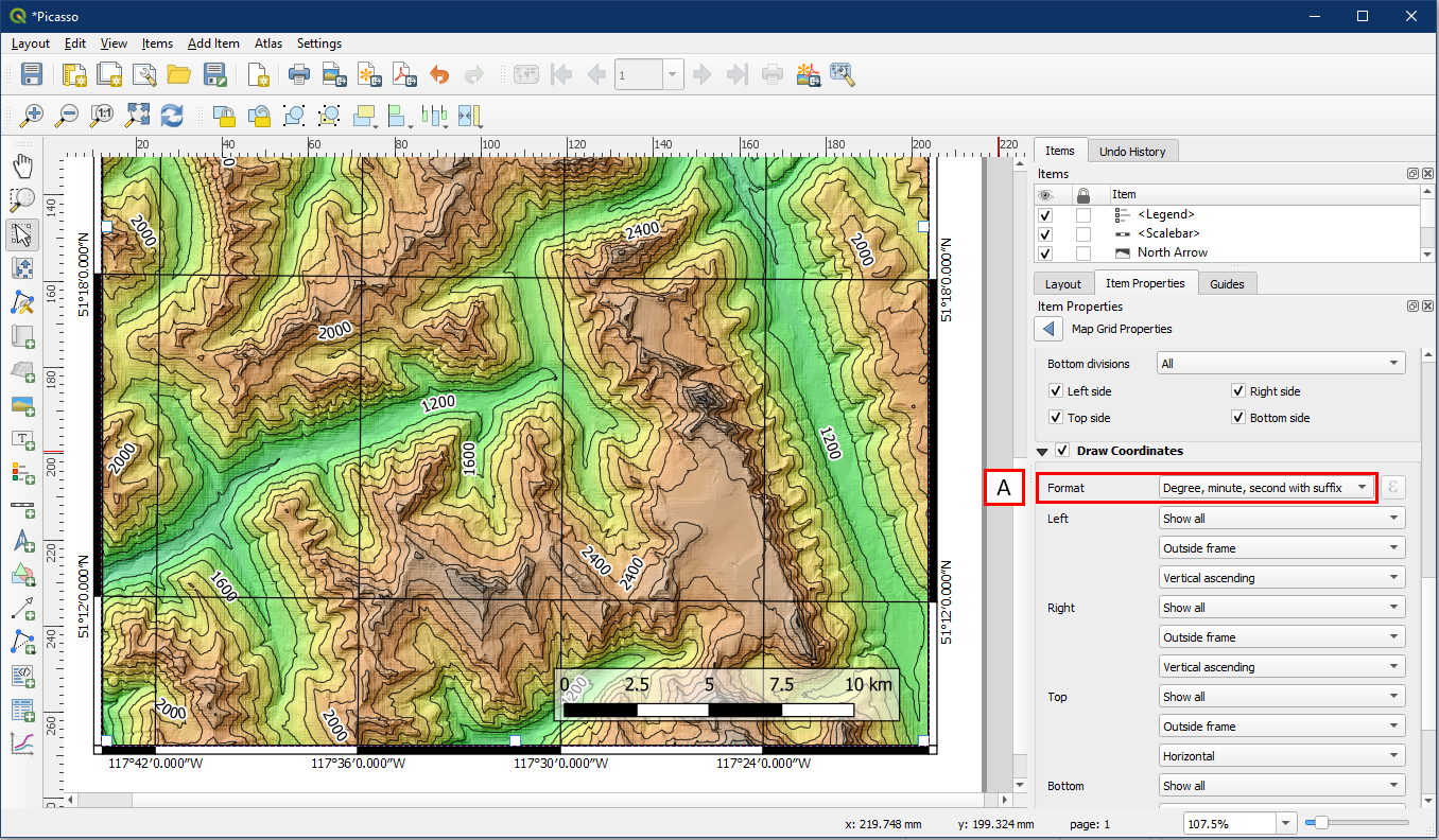
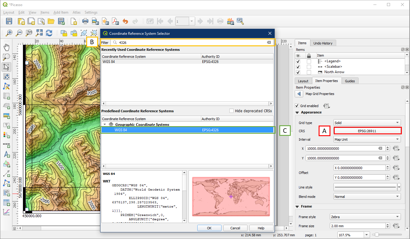
However, sometimes we may want to display geographic coordinates (latitudes and longitudes) in degrees/minutes/seconds instead. To do so, change the CRS (A), then search for CRS 4326 (B) and select it (C). Click OK.
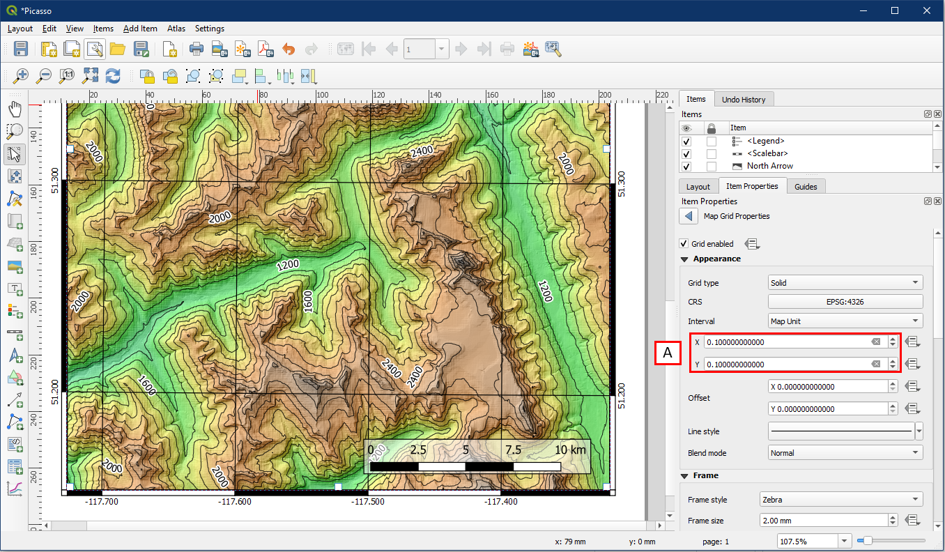
At first we won’t see a grid, because the grid interval is still set at 10000. But since geographic coordinates have a maximum of 90° for latitude and 180° for longitude, we need much smaller grid intervals. Change these values to 0.1 (A), and now we can see the grid coordinates in decimal degrees.
In most cases we display latitude and longitude in degree/minute/second format. So under Draw Coordinates, change the Format to Degree, minute, and second with suffix (A). Now the coordinates are in a format we normally see on topographic maps of Canada.